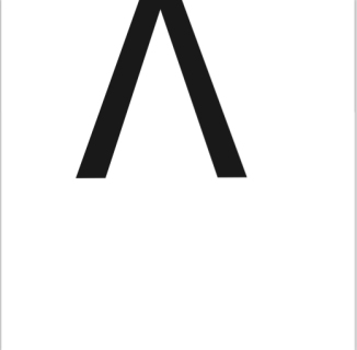
GIF Project, FINAL

OBJECT:

toilet

The concept began from something comedic then taking it a serious topic. The idea did change several times, but wasn’t difficult to congure up the final product. It has symmetry and focuses your eye on the central idea. The hierarchy and my choice of font/colors highlights the importance.

ACTION:

Road.gif

The concept began from taking a local element and a know lyrics. Using hierarchy it guides the reader through the GIF. The contrast makes it easy to read as well as the choice of type, no serifs.

ME:

TYSON.gif

The idea was using my 140 pound Rottweiler and German Shepard mix I would create the concept of being hungry especially students on campus wanting more to eat. The casual movement gives it another characteristic. Text and content both assist the idea of food even though the video has nothing to do with food. My choice to use Tyson was using any unique qualities he has to develop creative work from. Also, develop a funny memory for when he passes. Any concept needs to be as specific, but general as possible to target a certain demographic while still being relatable for most people.

POST CARD PROJECT, Stanley Morison, English Typographer,

This slideshow requires JavaScript.

I feel that the planning process was similar for me compared to previous projects. My designs changed as I went through. As I visual applied each piece I saw that columns and lines were important in this for this project. The stem of the font helped create my concept. It was difficult to create spacing because of the serifs on the letter and type. I created the importance of information from top to bottom and left to right, typically how the target audience will read or view this. The contrast of the red and black also guide the viewer.
I believe I accomplished the task given and applied a creative aspect to it. The research that was done was challenging to make this individual interesting and artistic freedom helped. I am satisfied with the outcome. The application of different elements worked well, but still had trouble finding the entire use of indesign. The ability to resize images in indesign was inconvient, but that was probably because the experienced user knows what size the image needs to be when importing or placing the image. The design abilities within the program didn’t hinder me rather than my ideas were better used in a different adobe program.
I did grow a little as a designer because I learned more about the history and concept. Also, I still need to take more time through the planning process. So, my time during the actual design is better used. In conclusion the project went well. My planning process still needs to be better served and I need to commit on one idea and not change my mind so much, design wise.


“ALONE” and Free, FINAL

this-one

We are among billions of people in this world yet we can feel ALONE in it. The location gave the feeling of a lost, but also hopeful because it is spelled out in a natural environment. On the other hand it is not natural for the letters to be on trees. The groups of trees could also symbolize a group and together.

I used a chainsaw to cut the letters into the trees and gave it depth by not keeping it on a flat surface.

Bob Dylan, FINAL

ORIGINAL

DAY 1

This is the final product and I am pleased about the outcome other than that I got lazy at the end because I didn’t research enough content or words to apply to the piece. I’m appreciate the artistic liberty I was given to explore this concept and try something new rather than just reproduce a flat image. I did find this version of the project extremely challenging because of my limited knowledge, but through that I learned new tools that allowed the creation to become more efficient. I working digitally did tell a different story because the meaning behind the piece is an authentic piece and it is difficult, not impossible to recreate that feeling.

The original promotional work I found was simple, but complex at the same time. Influenced by Duchamp, pictures of Bob Dylan and a unique inventive font. The sillouette seemed to come to life.

My techniques differed by the availability of tools. Also, the ability to go back and correct my mistakes quickly. Another is using solid colors by condensing text to form the color needed. I don’t have the ability to my knowledge to have a scale of colors and tones to create a rough emotion to the image.

If I had more time and knowledge I would figure out how to place the text easier around curves. Establish stronger colors in different ways without sacrificing reading the text. Lastly, do the original assignment also.

tb225_reproduction1final

Bob Dylan, Day 2

working-day-2

This is turning out to be more time-consuming than I thought. Even though I knew it was a in-depth project to begin with I still hope I get it done in time and meet the due date. This project is really testing my multi-tasking ability. It is challenging to make the type color distinctly different from each other, decisions. I don’t regret making the choice to do go this way because it will turn out to be a great portfolio piece I hope. I also learned some new tools and ways to accomplish task more efficiently.

Overall, my general idea of this project I feel will be very gratifying at the end. I learned new ways of developing contrast besides just with colors. Also the density of colors using words creates the opposite effect of what some people might assume.

Lastly I have noticed choosing different font families and classifications has affected my goal for the final piece. Again it has been tedious, but worth the time and effort to accomplish such a project. If anyone has input on how I can possibly edit this differently please feel free because I am opened minded to all opinions. Everyone’s voice matters.

Bob Dylan, Day 1

working-day-1

After much debate and advising on how to start this project I decided to erase the background to outline Bob Dylan’s face other than trying to line up text along the whole face. It is a variation of a reproduction and was given artistic freedom to put a spin on the assignment to challenge myself. I do plan I doing a total reproduction if I have time at the end. I have much work ahead and look forward to the final result.

Manipulating Letters and Forms

PART 1: ONE LETTER

Chose “V” because it is symmetric, but when it becomes associated with other aspects or placed in certain areas it develops other characteristics. It may look unstable at first, but ground seems rise and develop under the letter. The solid structure of the letter is why I chose it because I was trying to make it seem loose and free.

screen-shot-2017-02-01-at-7-01-36-pm

PART 2: TWO LETTERS

Chose “TT” because they could develop into a larger letter form, an “I”. There is no relevance to me other than it could be the first letters of my dog’s name and my name. Nothing changed how I formed the letters because you have to work with an open mind and not be bias when developing work. The positive and negative space with a reflective aspect gave it a reversible effect. Proximity was not used well because I outlined much of it. I learned a few tools, but that is from trial and error. I need to ask questions more when I run into issues. I change my mind too may times during class exercises. This did open my mind and I didn’t realize how many logos and brands use this technique like the WWF (Panda)

screen-shot-2017-02-01-at-7-18-15-pm

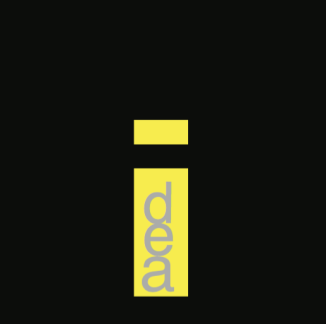
PART 3: TYPOGRAPHIC EXPRESSION

I used the word “idea” because the concept of sparking a new creative way to accomplish a task is appealing to me. So, the contrast was extremely important for this to work. The negative space for the background enhances the word and keying on the first letter. I applied spacing and sizing based on the neccesary ratios to the edges of the artboard. I visually communicated this by using a bright high value color to focus the attention on the message. The hierarchy and typical reading is from top to bottom so that was easy to build. Visibility was not and issue when all of those were put into place.

screen-shot-2017-02-01-at-7-19-56-pm

PART 3: HIERARCHY

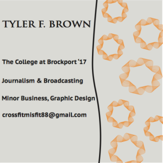
I visually sorted the importance of each piece. Then the font size and image size was decieded. Spacing has to be easy to read and gentle on the eyes. The temperature was decided early and the line to guide the reader was first. The colors of the ribbons were chosen not to be over saturated and distracting, but enough to draw attention to the information provided. This is my professional information and a hypithetical business card. I want to start developing my own personal business card I can hand out. This is why I chose to do this.

screen-shot-2017-02-01-at-7-20-33-pm